CSS Week 2 - Grid and Flexbox
This is another episode of my CSS learning challenge. If you’d like to know how this all started, you can read the introduction post.
Last week was fun. Both the Grid and Flexbox are newer CSS features and remove many pain points with positioning elements on the page. Unlike the last week’s selectors, I could see a practical use for almost every piece of information that I’ve learned.
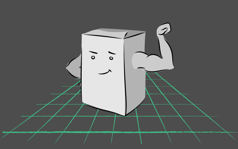
“Flexbox and Grid” by Ljubica Petkovic
What did I know
I knew that display: flex often solved my positioning problems. If an element didn’t align, I set display: flex on the parent element and voilà, problem solved. Apart from knowing that Flexbox is a bit more predictable than display: block, I didn’t know much.
What did I learn
Flexbox is a surprisingly old standard. In my mind, Flexbox was still at the cutting edge of browser technology, but Chrome fully supports it since 2012 and Firefox since 20141. Flexbox was the first CSS feature that provided complete control over box-alignment without hacks. This control has been since lifted into it’s own specification, and it’s also used by the CSS Grid2.
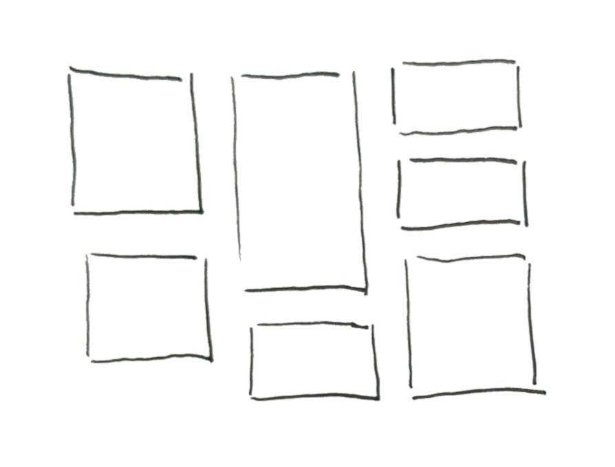
Flexbox aligns items in one dimension
Grid is a more recent standard. Chrome and Firefox fully support it since 2017. Using gap instead of grid-gap to set the spacing between tracks (items) is supported since 2018. The important thing is that the evergreen browsers fully support the CSS Grid Layout.
Grid is meant for two-dimensional positioning (i.e. you need both rows and columns to align), for example, creating the site layout or splitting your image gallery into two columns. You can use Flexbox for a two-dimensional layout as well (and it has been in Bootstrap 4), but it’s main purpose and power is a one-dimensional layout (row or column)2. For example, Flexbox would be suitable for Trello-like columns, where you want to align the cards into columns, but you don’t need them aligned in rows.
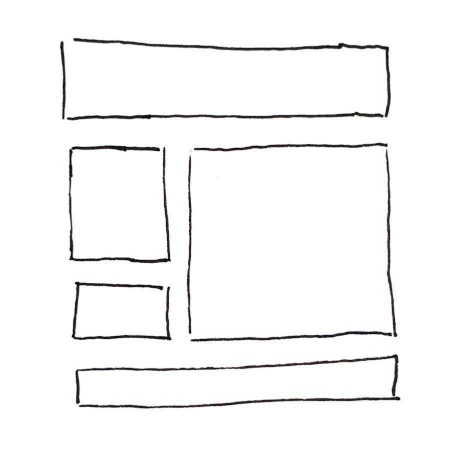
Grid aligns items in two dimensions
I also completely removed Bootstrap 4 from this blog and used CSS Grid and Flexbox instead. It wasn’t as easy as the online courses and web resources suggested. It took me two afternoons.
Resources for learning
I’ve listened to both FrontendMasters courses on the topic: CSS Grids and Flexbox for Responsive Web Design and CSS In-Depth, v2. If you don’t have access to FrontendMasters don’t despair, you can get the same information from MDN, but you’ll have to put in more work because you won’t get spoon-fed the information from video courses. Follow this MDN guide on Grid layouts - it’s concise and clear.
- Basic Concepts of grid layout - CSS: Cascading Style Sheets - MDN - Easy to digest guide explaining grid layouts.
- Grid garden - Fun game with 28 levels where you position water and poison to water plants and kill weeds.
- FrontendMasters
- CSS Grids and Flexbox for Responsive Web Design from Jen Kramer
- CSS In-Depth, v2 from Estelle Weyl - the interactive slides are publicly available at her GitHub
References
- A Complete Guide to Grid - CSS-Tricks
- A Complete Guide to Flexbox - CSS-Tricks
- A Complete Guide to CSS Grid - Codrops CSS Reference - much more extensive than it’s CSS-Tricks alternative
What I didn’t learn
What I’ve learnt this week has been immediately applicable, unlike last week. However, I still struggled when I tried to apply the knowledge for styling this blog. I understand the concepts well, and if I have a fixed, FullHD screen, I can create a grid with no problem. But I didn’t learn enough about the “responsive” part. Making the design responsive, I still create a few breakpoints and change the grid layout based on the breakpoint. Is that the best? I don’t know. I hoped that I wouldn’t have to use as many media queries after learning these cool new features.
My process
One week is a short time to learn two CSS standards, but at the same time, I need to keep this pace to get a complete overview in two months. After I know a bit of everything, I can go back and dive deeper.
Next up: Display, position and box alignment