CSS Week 3 - Display, Position, and Boxing-model
This was the most challenging section so far. Work and personal life intercepted my hour-a-day routine, and it took me three weeks to squeeze in the seven hours of learning. Also, this module’s boundaries weren’t clearly defined, which made me waste time branching out into unrelated topics.

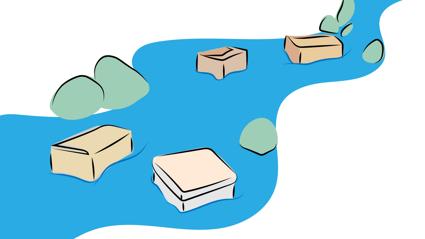
“Normal flow with boxes” by Ljubica Petkovic
My process
I’ll change the format of the previous weeks and start with the process. Vaguely defined boundaries of the module, no dedicated learning time, and lack of video courses for this week’s topic stretched the learning to three weeks.
The biggest problem this week was that I wasn’t clear about my learning goal and when will I consider my study finished. By definition, I don’t know what I need to learn before I start learning it.
Change 1: Clear boundaries
I’m going to spend the first hour of the week getting an overview of the topic and gathering a list of resources I want to learn from. I’ll order them by priority, and I’ll spend the next six hours going through them in the preselected order.
Change 2: Notes
I’ll make notes. I didn’t make many notes so far since I thought that I could always open MDN and read the documentation, but I noticed that I started forgetting what I learned. I’ll start making digital notes about the topics I’ve learned.
I don’t practice much of what I’ve learnt. I thought about including some practice time (e.g. tweaking this blog) in my study, but I don’t have enough time in the tight schedule.
What did I know
I knew that you could position elements absolutely. I knew a few display properties, including flex and grid, which I learned about the last week. I knew how padding and margin work for block elements, including the margin collapsing.
What did I learn
The most valuable thing I learned about this week was Normal Flow. That’s how elements get positioned on the page if you don’t change a layout or position. The block and inline element behaviour make the best sense in normal flow.
I vaguely remembered that people used display: float for layouts. Now I know that the only reason to use float is to make text flow around a block element on the page (e.g. image or aside). Modern layout methods completely removed the need for floats.
Position in CSS seems to be simpler than I thought as well. All elements have static position by default, which means the elements are positioned exactly where the layout puts them. You can offset the element using the relative position or take it out of the flow completely with fixed and absolute. And then there’s sticky.
Lastly, I’ve learned about the overflow and min/max-width/height. Interesting about min/max dimensions is that max gets ignored if it’s smaller than min, and the actual dimension is ignored if it’s not within the min-max range. There is a great explanation from Ahmad Shadeed.
Resources for learning
I found a fantastic video on the MDN site titled: “Why Is CSS So Weird?” made by Miriam Suzanne. It’s 15 minutes long, and it’s the best overview I’ve ever seen. It explains the motivation for creating CSS and why it’s so much different from styling printed documents.
- Introduction to CSS layout - MDN - this is the best place to start and regularly return back to as you learn about normal flow, flexbox and grid
- Min and Max Width/Height in CSS
- Identifying the containing block when positioning elements - MDN
- The box model - MDN
- Overflowing content - MDN